
The Management Dashboard is a new Home Page view that summarises events and the value of maintenance events for your organisation or area.
How can it help you?
The Management Dashboard is an optional view on the Home Page that provides a summarised view of current events and the value of maintenance events for you. This includes:
- Insight into the costs incurred from equipment and asset issues
- The savings generated through avoided losses of production and minimised downtime, and
- A summarised view of potential costs to be incurred and savings to be mitigated.
This was designed to aid you in managing the costs and identifying the value associated with operating and maintaining the machines under your care. Further, effective use of this dashboard can help you identify opportunities to save money and improve the overall financial performance of your maintenance operations.
Please note that the financial data used to generate this information is derived from the Event Impact feature. Hence, in order for it to be visible (and accurate), you will need to ensure you are adding this information using Event Impact.
The currencies displayed reflect the local currency of your location.
How does it work?
How do I access it?
The Home Page icon in the top left-hand corner of your dashboard now includes a drop-down box to allow you to select the Management Dashboard, Plant Room Dashboard or Standard (Default) Home Dashboard. Selecting Management Dashboard will bring you to this page.
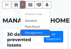
Your home page will automatically open on the last dashboard selected.
Key Features
The Management Dashboard includes 6 key tiles. These are the:
- 30-Day Prevented Losses Tile
- Event Impact Trend Tile
- 30-Day Costs of Monitoring Tile
- Events Pending Review Tile
- Events Validated Tile
- Events Pending Action Tile
30-Day Prevented Losses
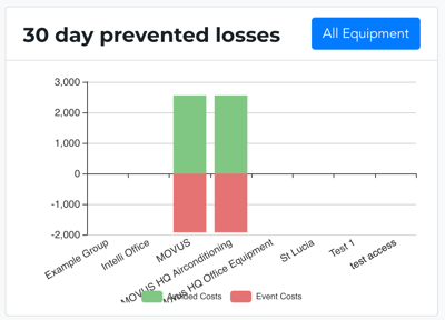
This tile is a bar chart displaying the total Event Costs and Avoided Costs over the last 30 days for the organisation or selected group/s. Here:
- The x-axis (horizontal) values reflect the assets within that equipment group that have Event Impact values entered in the last 30 days.
- The y-axis (vertical) values reflect both the avoided costs and the costs incurred.
-
Green: Indicates the total sum of the avoided costs for each asset. These are captured as positive values.
-
Red: Indicates the total event costs. This is the sum of the actual and estimated costs for all event/s on that asset in the last 30 days. These are captured as negative values.
-
The 'All Equipment' button links to the Equipment List page.
Event Impact Trend
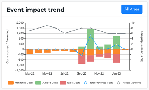
This tile includes a dual axis bar and line chart combination showing, from the last 12 months, the number of assets monitored and the total equivalent Monitoring Costs, Avoided Costs, Event Costs, and Total Prevented Costs. This brings together data from Event Impact, FitMachines onboarded, and the total hours monitored for the selected group.
What do they mean?
- Monitoring Costs: The total cost of MOVUS monitoring your equipment each month. This is the sum of monitoring hours multiplied by the appropriate monitoring rates. These are captured as negative values and shown in orange as part of the bar chart.
- Avoided Costs: The sum of the costs of the Cost Category "Avoided". These are captured as positive values and shown in green as part of the bar chart.
- Event Costs: The sum of the costs of the Cost Categories "Actual" and "Estimated". These are captured as negative values and shown in red as part of the bar chart.
- Total Prevented Costs: The sum of avoided costs, event costs and monitoring costs. Shown as a blue trend line on the line chart.
- Quantity of Assets Monitored: The number of FitMachines monitored in the given monthly period. Shown as a grey trend line on the line chart.
The 'All Areas' button links to the Event Impact Summary page.
30-Day Costs of Monitoring
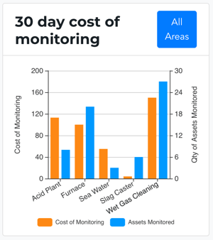
This bar chart shows the total cost of monitoring for the last 30 days against the number of assets monitored, using usage billing data. Here:
- The x-axis values reflect the assets within that equipment group that have Event Impact values in the last 30 days.
- The y-axis values reflect:
-
Orange: Costs of monitoring for the last 30 days based on the cost of hours monitored (hours multiplied by rate).
-
Blue: This is the maximum number of assets monitored in the last 30 days.
-
The 'All Areas' button links to the Event Impact Summary page.
Events Pending Review
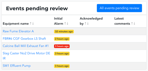
The Events Pending Review tile shows the equipment with new and/or acknowledged alarms (ie. they have not been investigated for validity, and no action has been taken). There are four columns on this tile. They include:
- Equipment Name: Links to the equipment's detail page.
- Initial Alarm: This shows the date of the first alarm for that event. Where an asset has not previously alarmed it will show the duration of the first alarm. The colour of the alarm reflects the type of alarm triggered.
- Acknowledged By: Displays the user that acknowledged the event (only if it has been acknowledged).
- Latest Comments: Displays the latest comment associated with the event.
The 'All Events Pending Review' button links to the Events List page.
Events Validated
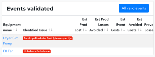
This shows the equipment currently with a valid alarm status. This means the alarm has been acknowledged as valid, and your team found something wrong. There are seven columns on this tile. They include:
- Equipment Name: Links to the equipment's detail page
- Identified Issue: This displays what category of issue was identified in the event (ie. was it an equipment failure or imbalance?). The colour of the identified issue is generated from the Plantroom Dashboard feature.
- Estimated Production Hours Lost: Displays the sum of lost production hours from the Event Impact feature, where the Cost Category is "Estimated" or "Actual". Values are shown as negative (in red).
- Estimated Production Losses Avoided: Displays the sum of lost production hours from the Event Impact feature, where the Cost Category is "Avoided". Values are shown as positive (black).
- Estimated Event Cost: Displays the sum of estimated and actual costs from the Event Impact feature. Values are shown as negative dollars (in red).
- Estimated Avoided Costs: Displays the sum of avoided costs from the Event Impact feature. Values are shown as positive dollars (black).
- Estimated Prevented Costs: Displays the sum of all costs for a given event where items with the Cost Category of "Estimated" and "Actual" are negative and items with the Cost Category of "Avoided" are positive. Where the sum is negative, values are shown as negative dollars (red). Where the sum is positive, values are shown as positive dollars (black).
The 'All Events Pending Review' button links to the Events List page, filtered to only show events marked as valid.
Events Pending Action
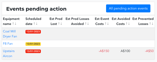
This tile list equipment in a pending action state. That is, the event has been marked as valid, and the equipment has been scheduled for maintenance (has a scheduled date on which this will occur).
There are seven columns on this tile. They include:
- Equipment Name: Links to the equipment's detail page
- Scheduled Date: This shows the date maintenance is currently scheduled for.
- Estimated Production Hours Lost: Displays the sum of lost production hours from the Event Impact feature, where the Cost Category is "Estimated" or "Actual". Values are shown as negative (in red).
- Estimated Production Losses Avoided: Displays the sum of lost production hours from the Event Impact feature, where the Cost Category is "Avoided". Values are shown as positive (black).
- Estimated Event Cost: Displays the sum of estimated and actual costs from the Event Impact feature. Values are shown as negative dollars (in red).
- Estimated Avoided Costs: Displays the sum of avoided costs from the Event Impact feature. Values are shown as positive dollars (black).
- Estimated Prevented Costs: Displays the sum of all costs for a given event where items with the Cost Category of "Estimated" and "Actual" are negative and items with the Cost Category of "Avoided" are positive. Where the sum is negative, values are shown as negative dollars (red). Where the sum is positive, values are shown as positive dollars (black).
The 'All Pending Action Events' button links to the Equipment List page, filtered to only show events pending action.
What else should I look at?
---
Thanks for reading. As always, if you have any questions, please contact our MOVUS Support Team here.