
The Time Waveform Plot allows you to listen to the accelerometer output of your machine.
How can it help you?
The Time Waveform diagnostic allows you to listen to your equipment from the office and work out if there is an issue.
This is because often, on-site, issues with the equipment cause changes that you can hear. We're making this visible to you from the comfort of your desk. For example, when you listen to the sound coming from the accelerometer, sounds like chipped gear teeth can become apparent.
Further, this feature allows you to verify an alarm suspected to be false.
How does it work?
What is the Time Waveform?
The time waveform (outlined in red below) is the time series data displayed at the top of the FitScope Page.
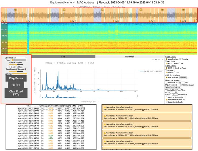
This chart displays a vibration wave comprised of many different frequencies. This is the 'raw' data collected by FitMachine that other diagnostic tools like the FFT and Spectrogram are built from.
The chart shows vibration amplitude vs time (a complex version of the wave in the FFT explanation article), with time on the x-axis and amplitude on the y-axis. The amplitude is indicative of how much the equipment is vibrating.
The time waveform is displayed alongside several other FitScope features. Most notable is an audio recreation playback of the vibration data collected (highlighted in red). This audio playback allows you to listen for changes in the behaviour of the equipment. You can listen to the accelerometer output of your machine over the previous three days. We can produce longer-duration waveforms (up to about a month) on request.
On V3 series FitMachine sensors, this playback is in real-time at 25.6kHz, the same as is sampled from the accelerometer. For V2.1 FitMachine sensors, data is collected at 4kHz and played back at 25.6kHz. This means that on V2.1 sensors, the audio playback will be higher-pitched than the actual data collected. This is typically more useful for detecting changes in vibration, as lower-frequency variation can be below the human hearing range.
How do I interpret it?
The time waveform data alone gives you information about how the vibration changes over the course of a sample and helps in identifying periodic impacts.
Features
Colours
On the waveform, you may notice the plot's background alternating between various colours. These colours give you an understanding of the AI Condition score at the time of that collection. Each potential colour and what they indicate are listed below.
- Green regions: Indicate green "normal" condition samples.
- Yellow regions: Indicate yellow condition samples. This means there was a minor deviation in equipment condition.
- Red regions: Indicate red condition samples. This means there was a major deviation in equipment condition.
- Pink regions: The data was collected within the equipment's learning period.
- Grey regions: The machine was believed to be not running.
- Grey/purple regions with diagonal stripes: This indicates 'on-demand' data; the longer time series data captures of higher quality (more clear).
Notification Markers
Three notification markers can appear along the waveform. These include
- The caution icon (⚠️): Indicates that a Yellow Advisory was triggered at that time.
- The alert icon (🚨): Indicates that a Red Alert was triggered at that time.
- Chart with upward trend icon (📈): Indicates a user-set RMS Measured Data Alarm was triggered at that time.
Date Markers
Along the bottom of the waveform, you'll notice orange tabs. These are date markers that help you distinguish across which days the data was collected. To understand the specific time of day, you can drag your cursor across the timeline. This will bring up the exact time in hours, minutes and seconds.What else should I look at?
- For information on accessing your time waveform diagnostic and how to use the tool and its many other features, please read How to Use the Waveform Feature.
- To learn more about the spectrogram (the chart sitting underneath the time waveform), please read What is a Spectrogram?
Some of our other diagnostic features:
---
Thanks for reading. If you have any questions or concerns, please reach out to MOVUS Support here.