
A spectrogram is an underutilised tool for condition monitoring of vibrating assets. This article gives you the understanding you need to use it to your advantage!
How can it help you?
A spectrogram is an excellent tool for reviewing changes in the vibration spectrum of your equipment very quickly. Some ways this can be helpful for you include:
- You can review alert periods to identify what has changed in the vibration spectrum. This can help you understand what is triggering the AI Condition score to react and why you might be getting advisories and alerts. The jet colourmap shows these changes well.
- You can mouse over the spectrogram to bring up the cursor and identify the time and frequency of a signal to get a brief understanding.
- It's very good for viewing periodic changes in the vibration of the equipment where you may have a period of data where the equipment is responding at specific frequencies.
- It can help you set the running cut-off in the correct position for low-amplitude assets as it clearly shows the difference in running and non-running vibration. Visually, you can see this in the spectrogram and the time waveform, and audibly, you can hear it in the playback.
- You can watch how the intensity of a peak changes during operation and over long periods of time and how this affects the overall vibration. We recommend colourmap 'hsv' for this.
- You can watch how your equipment with a VSD changes speed throughout the day/evening and the effect this has on the overall vibration and the Condition score.
- It is also very good at being able to very quickly identify potential harmonics and sidebands of various signals, which is a significant first step in a diagnostic process.
How does it work?
What is it?
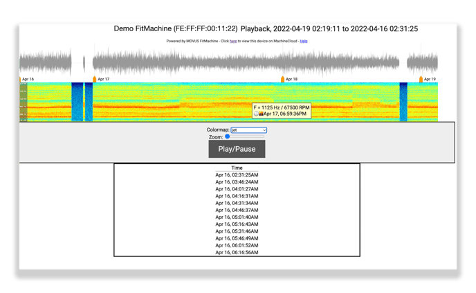
If you're not familiar, a spectrogram visualises your equipment's vibration. It's similar to a top-down view of a waterfall plot, where each vertical line is one of the FFTs we've collected. So the x-axis is time, and the y-axis is frequency.
On our waveform plot, the spectrogram sits beneath the waveform representation. An example spectrogram has been depicted above with jet colour mapping (coloured display). However, a series of colour schemes are available, which show the contrast between high- and low-amplitude signals in different colours. These colour schemes help you more quickly identify visual changes in condition, such as peaks and anomalies. We find that the contrast between high and low is often much better defined in the jet and rainbow colour schemes than in the grey.
The magnitude of the peaks is indicated by the intensity of the colours, where more vibrant colours indicate higher magnitudes. On the grey default colour scheme, the highest peaks are the darkest black, while background noise is light grey.
How can I access it?
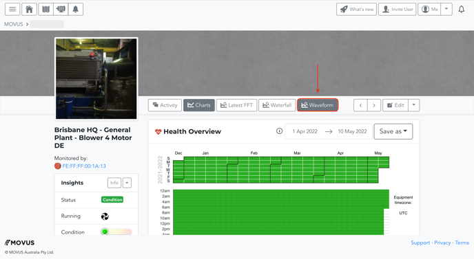
The chart is located on the Equipment Detail Page for any asset. Clicking the 'Waveform' button will bring up the diagnostic. Please ensure that pop-ups are enabled on your web browser. Otherwise, this will stop it from being able to load.
Where is this data coming from?
The data displayed in this tool is all calculated and displayed from time-series data collected through your FitMachine and calculated post-collection.
Most of the data is comprised of short periods of time series data where the accelerometer samples for 0.1 seconds, while there is also 'on-demand' data that appears, which can include up to 2 seconds of continuous time-series data. These 'on-demand' data collections are presented for analysis in the Interactive FFTs and Waterfall Plots.
The audio data is not the sound captured by a microphone at the same time as the accelerometer. Instead, it is a recreation of the sound of the sample from the accelerometer data collected.
What else should I look at?
- Understanding the Time Waveform Diagnostic
- Understanding the Interactive Waterfall Plot
- Understanding Interactive FFT
- About the Equipment Detail Page
---
Thanks for reading! If you have any questions or concerns, please reach out to MOVUS Support here.