
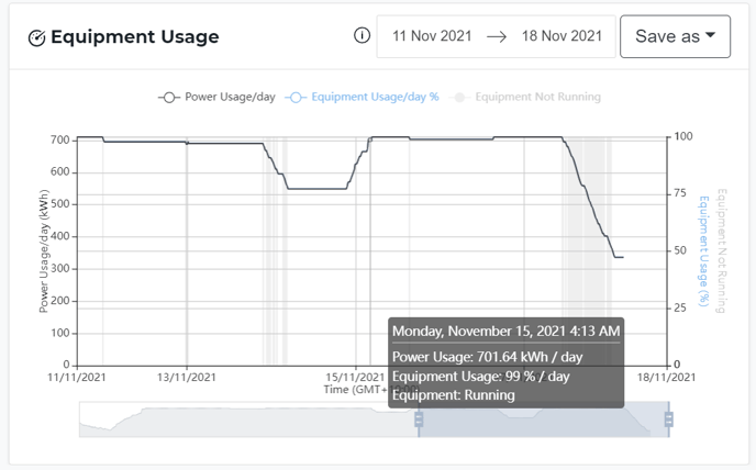
The chart at the bottom of the Equipment Detail View
How can it help you?
If you are interested in how often the equipment is running or how much power it is using, this feature is for you.
How does it work?
As with all our charts, you can click on any of the datasets to toggle them off/on and the date selector will be the same for all of the charts on the page
On the left-hand axis of the graph, you have the scale for Inferred Power Usage per day. It is represented by the black line on the graph.
On the right-hand axis of the graph, you have Equipment Usage which appears as a percentage of the day. This tells you how often your equipment is running during the day. It is represented by a blue line on the graph and is most often the same as the power usage per day line.
The grey shading on the chart shows times when the equipment was not running.
What else should I look at?
Other features that may be beneficial to you include:
---
Thanks for reading. As always, if you have any questions or concerns please reach out to MOVUS Support here.