
This article outlines what the Energy Overview chart is, how you can access it, and how it helps you.
How does it help you?
Using colour, the Energy Overview Chart highlights deviations in the energy usage of your equipment to identify trends like when the asset is consistently running or not-running, and at what time during the day or week it is experiencing changes in consumption. This is designed to help you identify the optimal times to perform maintenance and potential issues. For example, increased current consumption may indicate the need for asset maintenance.
How does it work?
The Energy Overview Chart visualises the asset's current usage over its lifetime. Through the colour of each block, the chart highlights whether an asset was running or not-running, and how much the asset's usage has deviated.
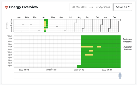
The calendar across the top provides a monthly overview, whilst the chart below displays daily and hourly health for the set dates. To the right of the chart, the Equipment Timezone is included. This is the timezone of the FitPower in question, NOT the timezone of your browser.
FitPower Current-Based Condition Statuses
There are four different colours that can appear on your chart, in line with FitPower's Current-Based Condition Statuses. If you're unfamiliar, our FitPower Condition Statuses assume that a mean value exists - that there is an expected current. Based on how far (how many standard deviations) your equipment's usage deviates from this mean value, different statuses are calculated.
Hence, the colours indicate:
- Green: The current was between 0 to 1 standard deviations from the mean value
- Yellow: The current was between 1 to 2 standard deviations from the mean value
- Red: The current was between 2 to 4 standard deviations from the mean value
- White: This indicates the equipment was not detected as running.
How do I access it?
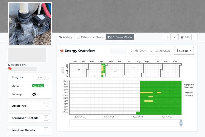
The Energy Overview chart can be found on any asset's Equipment Detail Page, under the 'FitPower Charts' tab. It will be the first chart on your screen.
The FitPower Charts Button will not be visible if your organisation has no FitPower sensors installed. If your equipment has both a FitMachine and FitPower installed, you can link the sensors and view both charts on the Equipment Detail Page. To do this, simply click the down-arrow next to "Edit" on the Equipment Detail Page.
Please see the image below for reference:
What else should I look at?
---
Thanks for reading. As always, if you have any questions or concerns please reach out to MOVUS Support here.