
This chart shows you how the FitMachine AI is responding to changes in equipment condition.
How can it help you?
Use this chart to look for trends in AI condition to discover how your equipment is changing. It is most powerful when used in conjunction with the Measured Data Chart.
Some trends to look out for include:
- An upward trend especially if it is accelerating - this is related to deteriorating equipment condition
- Changes in AI condition with no Measured Data change - this typically relates to a change in the vibration spectrum which can be seen in our Interactive Waterfall Plot feature.
How does it work?
As with all our charts, you can click on any of the datasets (Overall Condition, Vibration/Noise and Temperature) to toggle them off/on and the date selector will be the same for all of the charts on the page.
The main aspect of the AI Output chart is the Overall Condition which is the green line on the chart. This takes the multiple factors affecting the condition of the equipment and combines them into a single value between 0-1. It does this using the data that the FitMachine sensor gathered during its learning and compares each incoming sample to the models created.
You can also turn off the overall condition to see how the vibration/noise is affecting the AI which is shown by the blue line and the black line shows the change in temperature according to the AI.
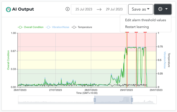
The cog in the top right corner allows you to access Alarm Thresholds where you can adjust the value at which your yellow advisories or red alerts occur, or restart learning.
Incorrectly editing the alarm threshold values can cause adverse effects as you are editing the sensitivity of the MOVUS AI. Thus, please contact MOVUS support before using this feature.
What else should I look at?
Other features that may be beneficial to you include:
- Understanding the FitMachine Measured Data Chart
- Understanding the Equipment Usage Chart
- Understanding the Health Overview Chart
---
Thanks for reading. If you have any questions or concerns, please reach out to MOVUS Support here.